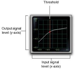
Dynamics III Graph Display
The Dynamics Graph display—used with the Compressor/Limiter and Expander/Gate plug-ins—shows a curve that represents the level of the input signal (on the horizontal x–axis) and the level of the output signal (on the vertical y–axis). The orange vertical line represents the threshold.
Use this graph as a visual guideline to see how much dynamics processing you are applying.
Dynamics graph display
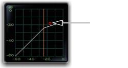
The Compressor/Limiter and Expander/Gate plug-ins also feature an animated, multi-color cursor in their gain transfer curve displays.
The gain transfer curve of the Compressor/Limiter and Expander/Gate plug-ins shows a moving ball cursor that shows the amount of input gain (x-axis) and gain reduction (y-axis) being applied to the incoming signal.
Gain transfer curve and cursor showing amount of compression
To indicate overshoots (when an incoming signal peak is too fast for the current compression setting) the cursor temporarily leaves the gain transfer curve.
The cursor changes color to indicate the amount of compression applied, as shown in the following table:
Cursor Color | Compression Amount |
white | no compression |
light orange | below full ratio |
dark orange | full ratio amount |