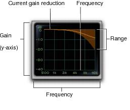
De-Esser III Frequency Graph Display
The De-Esser Frequency Graph display shows a curve that represents the level of gain reduction (on the y-axis) for the range of the output signal's frequency (on the x-axis). The white line represents the current Frequency setting, and the animated orange line represents the level of gain reduction being applied to the signal.
Use this graph as a visual guideline to see how much dynamics processing you are applying at different points in the frequency spectrum.
De-Esser graph display